If you're starting a web app development project, you know that one of the most important aspects of your job is to ensure that you design a web app that users will love using. But, that’s not always easy.
In fact, 25% of project failures are attributed to UX design issues! Web app design is made all the more difficult when you’re working on a shoestring budget and within tight deadlines.
Based on our 15 years experience in the field, we have prepared steps you can take to design a user-friendly web application fast and without breaking the bank. Let's get started!
What is web app design?
In the simplest words, web application design is the stage of software development that focuses on the user interface (UI) and overall user experience (UX). The focus of web app design is fully on the users:
- How users experience the web app
- Whether the web app responds clearly to user needs
- If the web app makes it easy for users to find what they are looking for
Typically we think about the user interface piece of web app design as how the web application looks: its aesthetics, its colorstory and what visual story it is telling. On the other side, the user experience (UX) piece of web app design is focused on how the application functions: its navigation and ease of use. The UI and UX work together to create a well designed web application.
Web app design vs website design
Web apps and websites share many similarities. Both web apps and websites can be accessed from and operate without the need to install additional software. Both require keen attention to graphic design and UX.
Regardless of their similarities, web apps and websites are in fact different. They have different uses, user needs and expectations. It’s important to understand the difference between these two categories of web design if you want to optimize your web app design process and effectively cater to your web app users.
Let’s take a look at their key differences:
| WEB APP DESIGN | WEBSITES DESIGN | |
|---|---|---|
UI functionality | Dynamic, interactive | Static |
Main purpose | Allow user to perform actions | Display or gather information |
User flow | Predefined user flows, guides user step-by step through distinct processes | Open use flow |
Design focus | Responsive site elements, performance across multiple devices, and a streamlined user journey | Planning the structure and content to look clear and visually attractive |
Design complexity | More complex process | Less complex process |
Team required | Requires entire project team to design and plan user processes from start to finish | Work to aesthetically rearrange information can be done by one person |
Why is web app design important?
Building web applications can be costly - and a substantial line item on your budget is likely UI/UX design services. It can be tempting to try to save on costs in the area of web app design, but the reality is that 25% of project failures are attributed to UX design issues; the design of your web app could literally make or break its success. But that’s not all. Investing in web app design is important because:
- First impressions matter. The design of your web app will be the first thing users see, and it will set the tone for their entire experience.
- Design can influence conversion rates. A well-designed web app that prioritizes thoughtful user interface design is more likely to convert users into customers or subscribers.
- Good design conveys trust. More users are likely to trust web applications that look professional and well-designed.
- You need to stand out from the competition. In a crowded marketplace, a well-designed web app with a clean interface and simplified navigation can help you stand out from the crowd.
Functionality is key. Above all else, your web app should contain all the features necessary for users to be able to accomplish what they need to do quickly and easily.
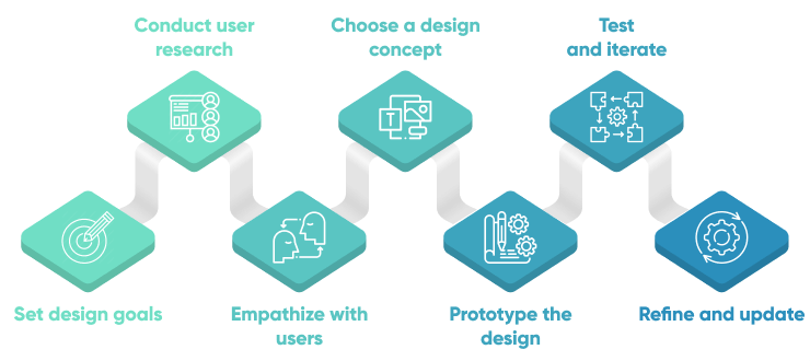
How to design a web app that users will love - 7 steps
1. Set design goals
The first step of web application design is to specify your goals. Without clear goals, you won’t be able to design a web app that meets your needs. To draft goals, design teams rely on design briefs. A design brief is a document that outlines all the essential components of the design project. It serves as the project's backbone and a communication tool for the customer and designer.
The design brief gives the designer an idea of what the user needs in the product and what type of design will fulfill his needs and requirements. A design brief for a web application should include:
- Web application overview. Succinctly describe the main function of the web application. Without clarity on purpose, you risk the web app design process producing something that is not aligned with the main intent of your web app product.
- Target audience details. Who will be using your web application could dictate things such as its color palette, the acceptable learning curve, and its overall look and feel. Ensure you have conducted adequate market research to understand your audience’s needs, preferences, and expectations.
- Scope. You may be creating a brand new web application, or you might be updating the design of an existing web app. Make sure you clarify the scope, so your team can produce appropriate web app designs to fulfill your needs.
- Success criteria. The web app design process must feed into the overall web app development project, and thus, should take into account the relevant key performance indicators (KPIs) and objectives and key results (OKRs) set by the product manager.
- Project team. List all of the creative and project management team members who will be working on the project, along with their relevant tasks and responsibilities.
Deadlines. The design brief should provide the final delivery date of designs, along with any relevant milestones that should be achieved along the way. These deadlines should be aligned to the web application’s broader development schedule to prevent dependency issues.
2. Conduct market research
Before you can design compelling web applications, you need to understand the market, your potential customers, and what the competition is doing. There are many ways to conduct this kind of research including:
- Interview your target market. Your most important task is to understand what exactly the user wants from your web app. Meet users and ask questions about what they want to achieve using your product. Observe them in their working environment and see how they handle their daily problems.
Survey existing users. If you already have a functional web app or other related products, you might consider sending out a survey to your users. Ask them what they are interested in, what their top priorities or pain points are, and even what other web applications they enjoy using.
Don’t underestimate the power of speaking to real people in your target market. This is the absolute best way to understand what design choices will resonate and allow you to provide a truly valuable web app experience.
3. Empathize with users
After you have a sense for the market, the competition, and who your users are - and perhaps even what their needs and expectations are, it’s time to dig even deeper. Take your user research to the next level by empathizing with your users.
We suggest using one or more of these methods to begin empathizing with your users:
Create an empathy map
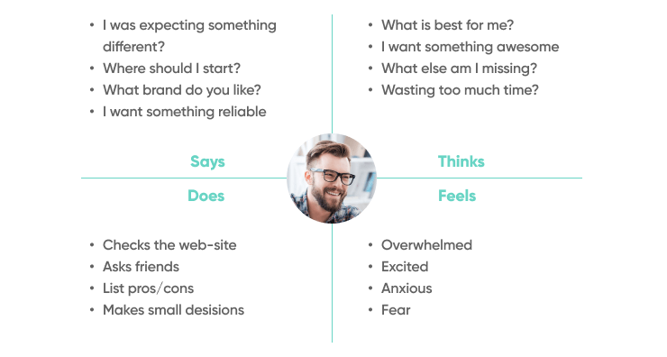
An empathy map is a simple visual tool that captures knowledge about users’ behaviors and attitudes. A traditional empathy map captures four levels of information: what the user says, what the user thinks, what the user does, and what the user feels when he/she is working on a product or trying to complete a task.
This information helps you to:
- Develop a common and shared understanding of your users
- Discover weaknesses in your user research
Uncover user needs that sometimes even they don't know about
Draft user personas
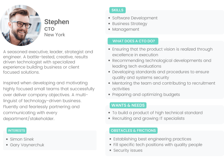
Personas help to define a standard representation of your users’ behaviors, challenges, and motivations. They can make it easier to define user segments and target them while making design decisions. Your web application may utilize existing personas as defined by a product manager, or you may need to create new personas as part of the web application design process.
Create a storyboard
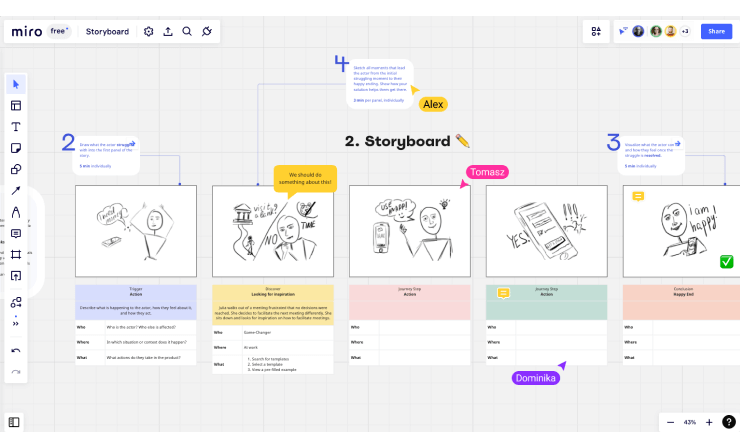
A storyboard allows you to create a low-fidelity visual that focuses on users and their actions, thoughts, goals, emotions, and relationships. A storyboard should cover a specific situation or scenario and help you to view the sequence of actions that the user will perform to complete that scenario. Sharing storyboards among stakeholders helps you get feedback and improve your ideas before moving on to the next stage of the web application design process.
Web apps that provide the most value are built on a deep understanding of what users are thinking, doing, and feeling. Don’t be afraid to spend significant time on this stage to thoroughly understand your potential customers - it’ll pay off in the long run.Define functional scenarios
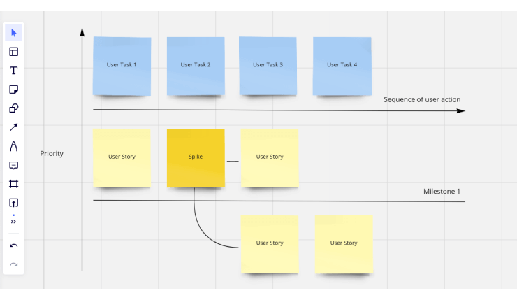
Define specific user scenarios where a user is trying to achieve a particular goal with your web app. Then, think about the best possible experience for users to complete that scenario. Only when you know who will do what on your product, and how and why they do it, will you be able to define a design that closely matches the actual requirements.
4. Choose a design concept
During this stage of the process, a UI designer takes a blank canvas and begins to sketch out the UI design, drawing inspiration from the information gathered in the previous steps.
This includes defining an efficient layout for all main screens, deciding on the information architecture for the web app, creating icons, selecting the color theme, defining typography styles, and setting UI guidelines that can be used by developers and other designers in future stages of the process.
We recommend you start with a moodboard, gather alignment from your stakeholders, then move onto an ideation map to flesh out your design concept.
Moodboard
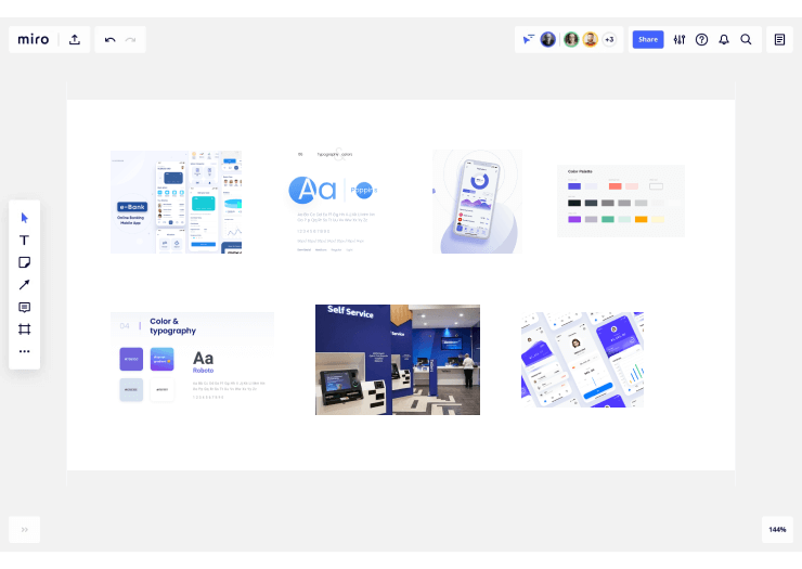
A moodboard defines the visual look of your product design. By combining a collection of images, styles, text, colors, and icons, you can present the layout of your product that helps a wider audience to understand the purpose of your product. By arranging UI elements in different ways, you can create multiple moodboards and then decide on the best one based on the audience feedback.
Ideation map
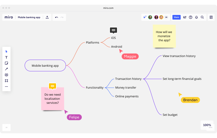
Ideation is the process of implementing various ideas and seeing how they work. By following this approach you can figure out both positive and negative aspects of your idea. To make things easier, list out your negative feelings on the left side, and your positive feelings on the right side, and then compare various options.
5. Prototype the design
With a design direction established, it’s time to begin prototyping the design. In this stage, you will work from low fidelity up to high fidelity mockups of the web app. Typically, you’ll begin with a flowchart or a ultra-basic paper sketch, share it with stakeholders, iterate, then return to stakeholders for another review.
Flowcharts
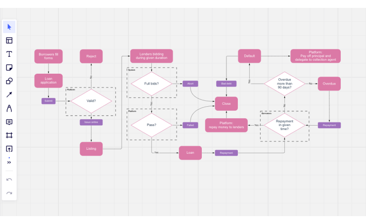
The user flow charts represent the flow of the screens the user will go through to perform certain tasks using your product. The flowchart begins with the entry point to your product, like a home page or a login screen and ends with the exit point, where the user completes the process by following several steps in the flow. User flows help designers depict the experience that users will get while interacting with the product.
Wireframes
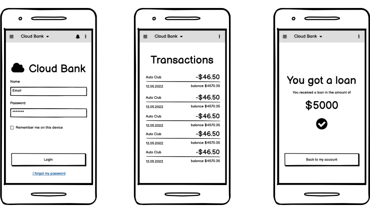
Wireframing involves the visualization of the skeleton of the digital products and applications. The wireframe shows which interface elements will be present on each page of the application, providing stakeholders an early sense for how the product will look and feel. For wireframing, you can use multiple tools like Figma, Sketch, Axure and Balsamiq.
Design mockups
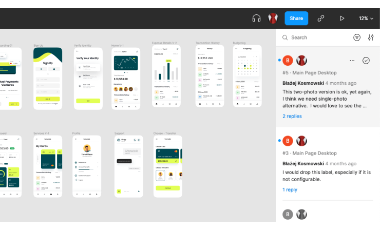
After wireframing, you can design visual images and link the screens in a prototyping tool to create a digital prototype of your product. A prototype helps to visualize the product design in a way that is very similar to the working product using Figma.
6. Test and iterate
A team can test the usability of the prototype as soon as it is finished. Unlike QA testing and A/B testing, the major objective of usability testing is to get opinions from actual users of a product to determine how user-friendly the interface is and whether the user can accomplish their objectives using the product.
There are several types of usability testing including:
Comparative usability testing
Comparative usability testing is done to either compare your web app with a competitor’s product or to compare two versions of your web app to each other (A/B testing). Either way, the purpose is to identify the positive and negative points of both designs. This can help the team to optimize their design to best meet the needs of real users.
Explorative usability testing
Explorative usability testing is conducted during the early part of the design process to get open-ended feedback on design ideas. Because it is open-ended, you can use this type of testing to identify gaps in the design as well as to provide direction for future design iterations.
Usability evaluation
Usability evaluation occurs after all essential modifications have been completed and the product is launched in the market. This is a good time for web apps to be evaluated against functionality and user experience standards, with the goal being to ensure that the product meets user needs and expectations.
PRO TIP: Following user testing, designers can do multiple iterations of UI and UX design before handing off the design to the development team for implementation. The UI and UX designers provide any required support in the implementation process and perform an audit of the implemented UI and identify any gaps. They continue to work after the product is released and focus on further improvements in the experience.7. Refine and update
UI/UX designers’ work is not complete once the product is released into the market. As time goes on, designers continue their work to keep the product updated as per new UI and UX design trends.
Further testing and evaluation
After the launch of a product in the market, the process of testing continues to ensure that the key functions of the product are working well. Additionally, you can observe how the user interacts with your product and use this data to fuel design optimization work.
Improvements and new features
Over time, there will need to be new features added, new technology advancements to use, and perhaps even other products within the company to integrate the web app with. To meet changing needs of users as well as the business, the designers should implement the necessary design changes.
Redesign
Sometimes a full design will be warranted. This may happen due to rebranding across the company, to help support a new user group, or simply to provide a more updated, modern interface as trends change. If a redesign is required, the team should start the web app design process from the beginning to ensure nothing is missed.
PRO TIP: Although the design process stages and deliverables listed above are most commonly used to design a web app product, they can be customized based on any team’s requirements. Similarly, the deliverables at each stage can be skipped if not required. The result of the design process is to achieve the desired experience and user satisfaction.Conclusion
Designing web apps can be a tricky process, but with the right steps and processes in place, you can ensure that you create a web app that users will love.
Start by setting design goals and conducting market research. Then, empathize with users, choose a design concept, and prototype the design. After refining the design, use user testing to ensure the app meets user needs and expectations. Finally, continue to refine and update the design as needed.

